Pluto TV × My5 for the UK.
I led research and design exploration for the integration of Pluto TV with the UK's My5 network — translating local viewing habits into layouts that simplified navigation and amplified content discovery.
Understanding how the UK actually watches.
Paramount wanted to simplify its tech stack by integrating Pluto TV with My5 — but the team lacked clarity on how UK viewing habits, expectations and cultural nuances might differ from other markets.
Method
I ran in-depth interviews with UK viewers focused on viewing patterns, device usage, content discovery and expectations of free ad-supported TV.
Findings
- A stronger emphasis on live and linear programming than anticipated.
- A desire for seamless access to diverse libraries without juggling multiple apps.
- Frustration with fragmented tech stacks and repetitive sign-in flows.
Three directions, one shared language.
I produced low-fidelity wireframes as distinct directions — content-first views, simplified switching between Pluto and My5, and hybrid layouts that respected mixed consumption habits — and used them to drive collaborative stakeholder decisions.

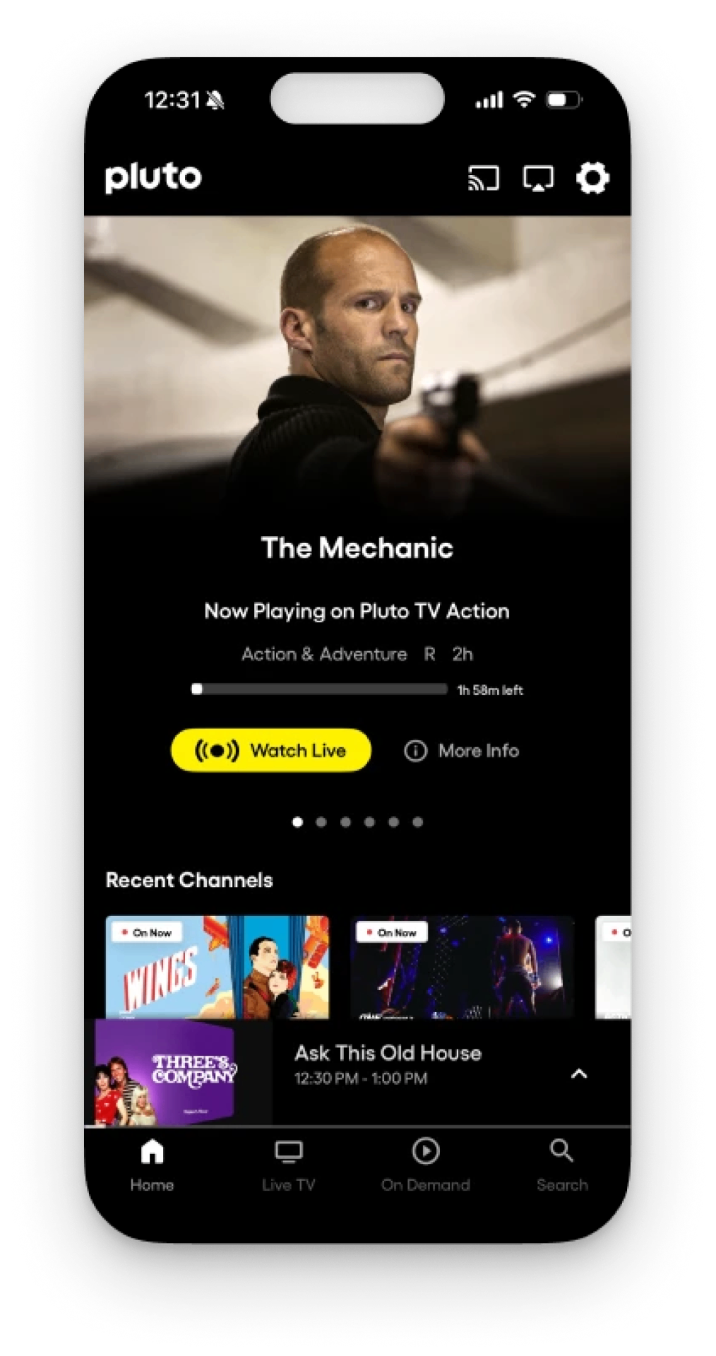
Cinematic on small screens.
The mobile layout starts with a full-bleed cinematic hero that bleeds edge-to-edge for immediate visual impact, with a white headline floating over the image and a single yellow accent driving the primary action.
- Filled CTA versus secondary ghost button to keep a clear hierarchy.
- Three-tier hierarchy: title → metadata → actions, with metadata in a lighter style.
- Animated broadcast icon signals live, interactive content.
- Muted progress bar stays minimal and contextual.
- Icon-forward tab bar with an understated active state.
- Consistent thumbnails carrying subtle "On Now" tags.
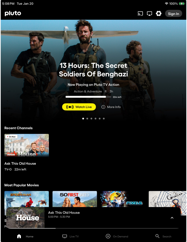
Letterbox composition, lean-back ergonomics.
On tablet the hero shifts to a letterbox cinematic composition that lets editorial imagery breathe, while persistent navigation and a mini-player respect the lean-back posture.
- Title stays readable over complex imagery via text shadow and placement over darker zones.
- Progress bar scaled proportionally to runtime duration.
- Recent Channels combines a thumbnail card with a text block — title, rating, time remaining.
- Persistent mini-player overlaps a dark card; thumbnail, title and time are readable at a glance.
- Nav icons pair with full text labels — space-afforded, reduced cognitive load.
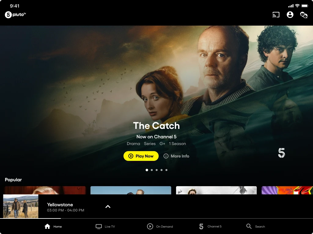
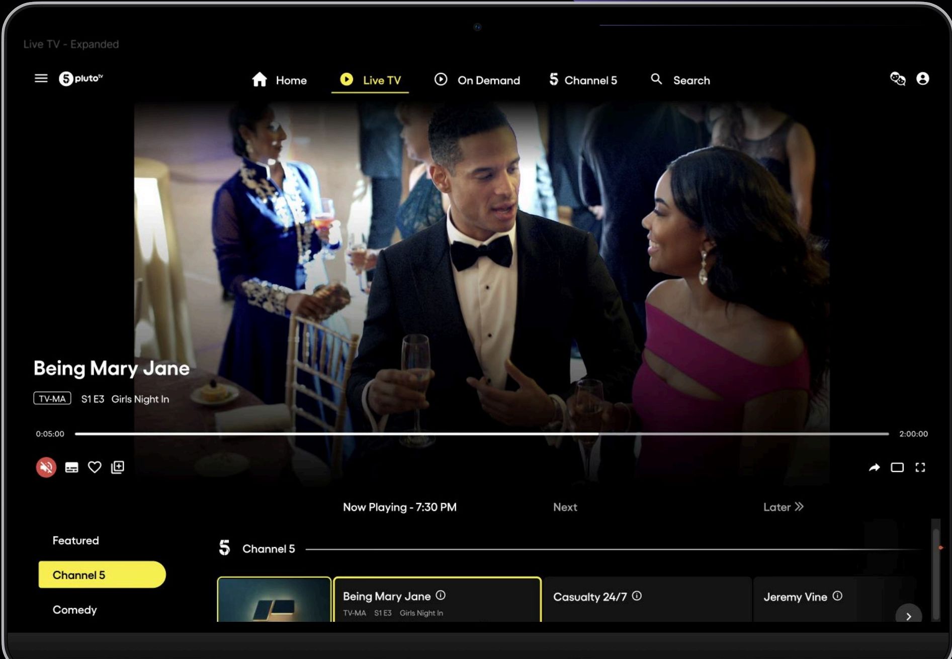
Centered nav, EPG-led discovery.
The desktop web experience moves from bottom tab bars to a centered top nav, with the player taking half the vertical space and an EPG anchoring discovery below it.
- Active state on "Live TV" uses a yellow accent with filled play icon — no underline.
- Player takes half vertical space; controls grouped below — playback left, view mode right.
- Scrubber shows elapsed and total time; thin and minimal.
- TV-MA rating sits in an outlined badge, separating classification from metadata.
- EPG below the player runs three columns: Now Playing, Next, Later.
- Current program carries a yellow left-border accent — a "you are here" indicator.
- Yellow scrollbar on the EPG maintains brand cohesion down to the scroll affordance.
A system that respects two brands and one viewer.
I extended Pluto TV's design system to meet UK regulatory standards — accessibility, content labeling — and reconciled My5's existing conventions across mobile, tablet and connected TV so one viewer never felt two brands fighting for attention.


More usage, more registrations, one unified product.
The integration delivered measurable results — +30% Pluto TV usage and +54% registrations in the UK — while unifying Paramount's tech stack and strengthening its presence in a key international market.